


Scott Albrecht for 3sixteen.
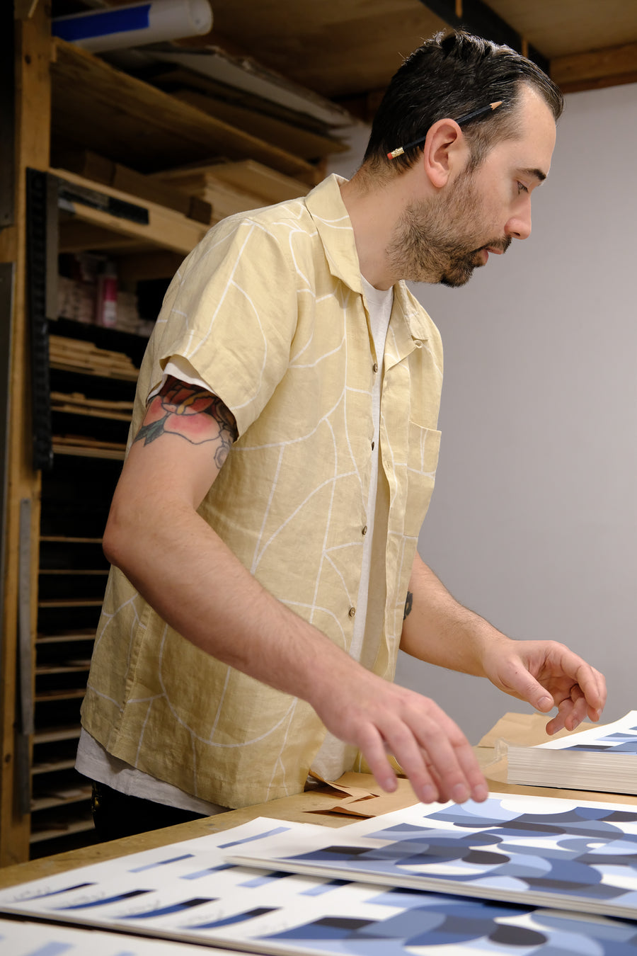
Scott Albrecht is a Brooklyn-based artist whose work we've been big fans of for over a decade now. We were first introduced to him through our good friend Jeroen Smeets, who runs a great art project called "The Jaunt" where he sends various artists on trips around the world and funds said trips by selling artwork that is inspired by their time away. In conjunction with The Jaunt, we hosted an art show for Scott at our little showroom at 162 Allen Street in 2015. A year later, we partnered with Scott again to present a series of wood assemblages called "Together" at our LA flagship - you can read more about that here. As we started putting together a roster of friends to collaborate with for our 20th anniversary, Scott was naturally at the top of the list.
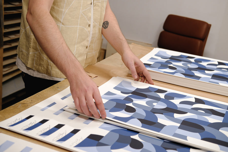
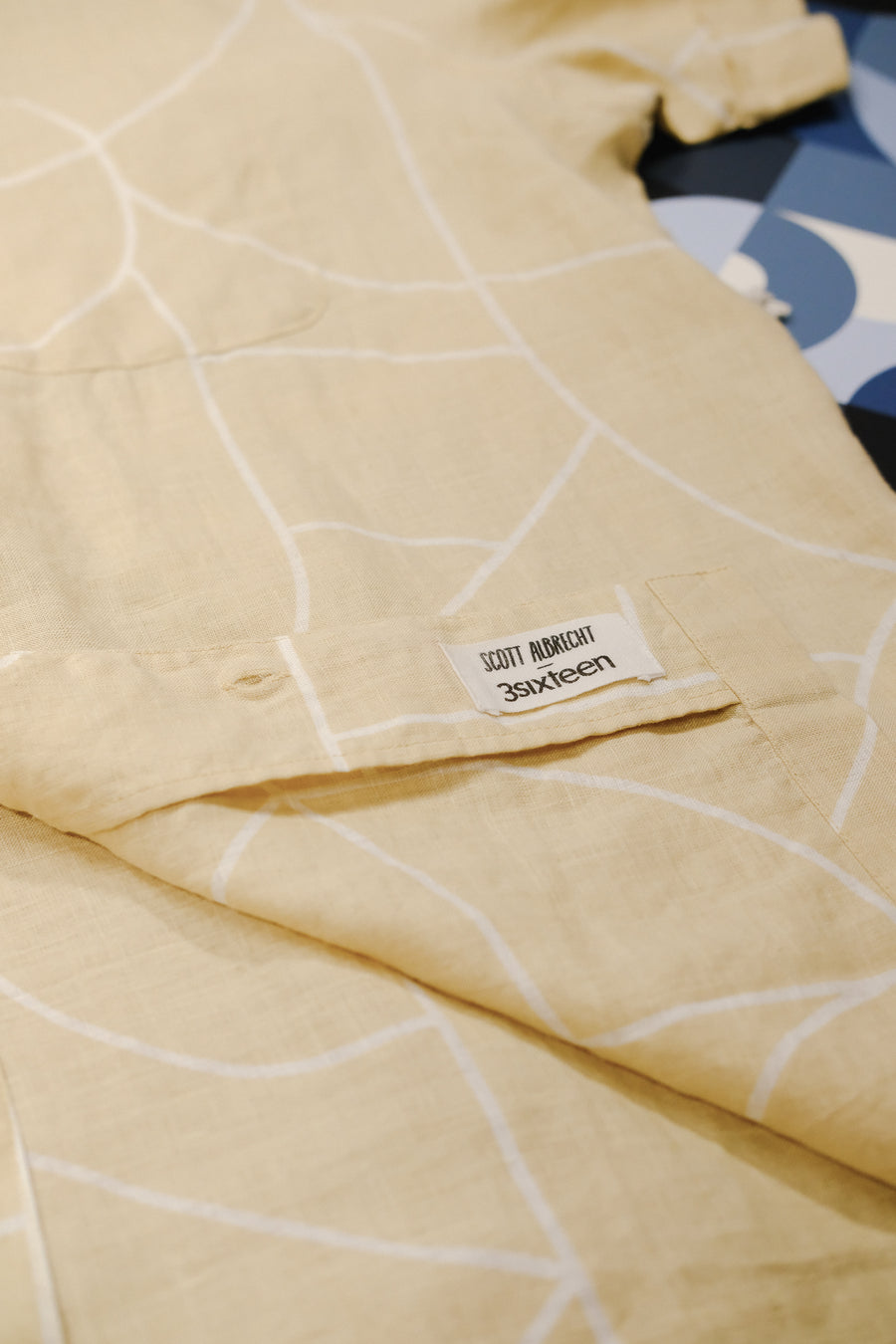
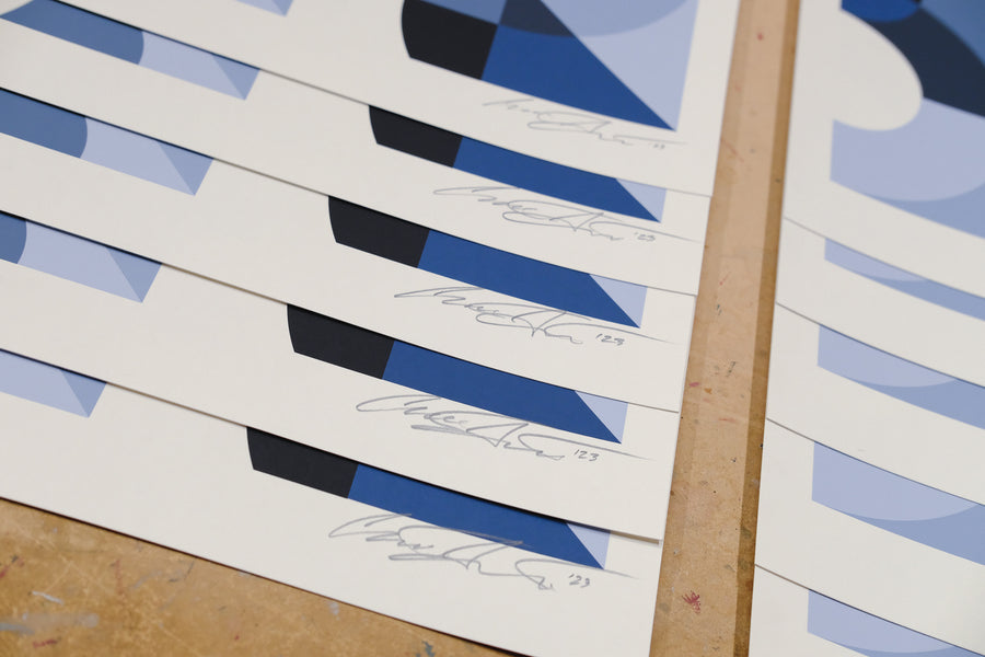
For those of you who have been following along with our brand's journey for some time, you'll know that this is about more than clothes for us. We've tried to use 3sixteen as a vessel to introduce you to people whose work we are inspired by - both within and outside of the world of fashion. Scott's work is meaningful to us in both its elegance and depth. We approached him to create some original art that centered around our brand's motto - something that has meant a great deal to us, and in turn, to many of you over the years. That artwork was then meticulously silkscreen printed by Kayrock in Brooklyn, NY into an edition of 100. Alongside that, we took a section of that artwork and turned it into a print for a Vacation Shirt. We're incredibly proud of how both pieces turned out and are excited to release them this week. We sat down with Scott a few weeks back to chat about the project.
Your recent book “In Time” covered the last 5 years of your career, and overall it seems that time ends up being an ongoing theme in your work.
Definitely; time and its passage seem to become a main character in a lot of the things I work on. Around the time we connected to start talking about this project, I was finishing up pieces for a solo show called “Holding Time” at Hashimoto Contemporary. Many of the themes I was creating for that exhibition lent itself to the conversation we were having, being that this is your 20th anniversary. What I like about the idea of celebrating an anniversary like this is it isn’t so much about a specific point in time, but the landscape across these two decades. The highs, lows, and everything in between.
After a bunch of brainstorming, the idea we landed on was creating something out of the tagline that we’ve been using for our brand since its inception - “The Last Shall Be First.” It’s a motto that we’ve tried to live by and live up to over these past 20 years, and you were able to turn it into something beautiful.
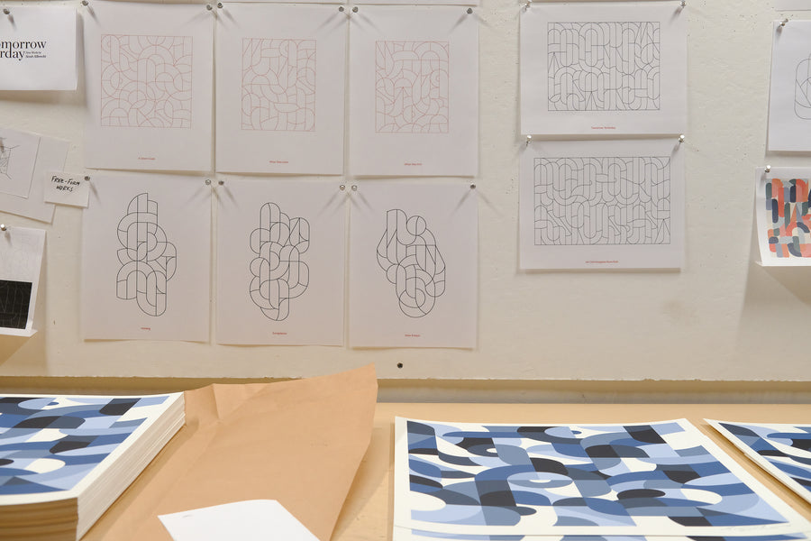
Thank you! One of my more signature styles is this series which uses abstracted typography. At first glance it looks like a bunch of forms, shapes, or a pattern - but the intention is that the letterforms are abstracted in a way where you may instinctively see something that could look like a letter, and that will hopefully pull you in to look more closely.
I have a background in graphic design and a lot of typography is designed for quick consumption. As a reader or viewer, you typically don’t really sit with the message for that long no matter how deep it is. Within my work, my hope is it has the opposite effect since the legibility is secondary, it encourages the viewer to spend more time with the piece and ultimately their relationship to it.
The way in which the letterforms are abstracted leaves each character segmented, pushing and overlapping on top of one another. In that sense, any one shape doesn’t hold much significance but the way in which they all come together allows them to make something larger than themselves. I think you could extend that metaphor to the anniversary in that it’s not about any one milestone but more about how all of them have come together and informed you to this point.
We - and many of your collectors I’m sure - really enjoy your usage of colors and the palettes you typically employ with these letterform works. With our specific piece, though, you took a different and thoughtful approach where you went with various shades of blue. Our first thought was that it referred to how denim ages.
Color, for me, is a big part of my process and is something that I’ve learned to grow with. Because my work is abstract, I tend to look at color as the first communicator. You’re not reading something, you’re seeing something and that something is form and color. With this collaboration, the gradient of blues was meant to echo the story and experience of 3sixteen. You’re known for denim among so many other things; so the various shades of blue speak not only to the swath of offerings you have, but also the way things age beautifully over time.
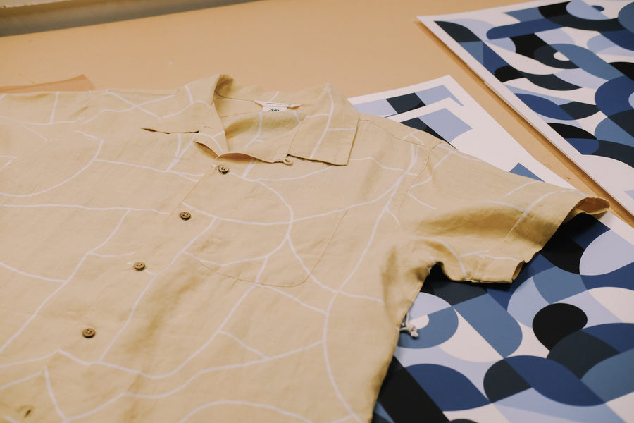
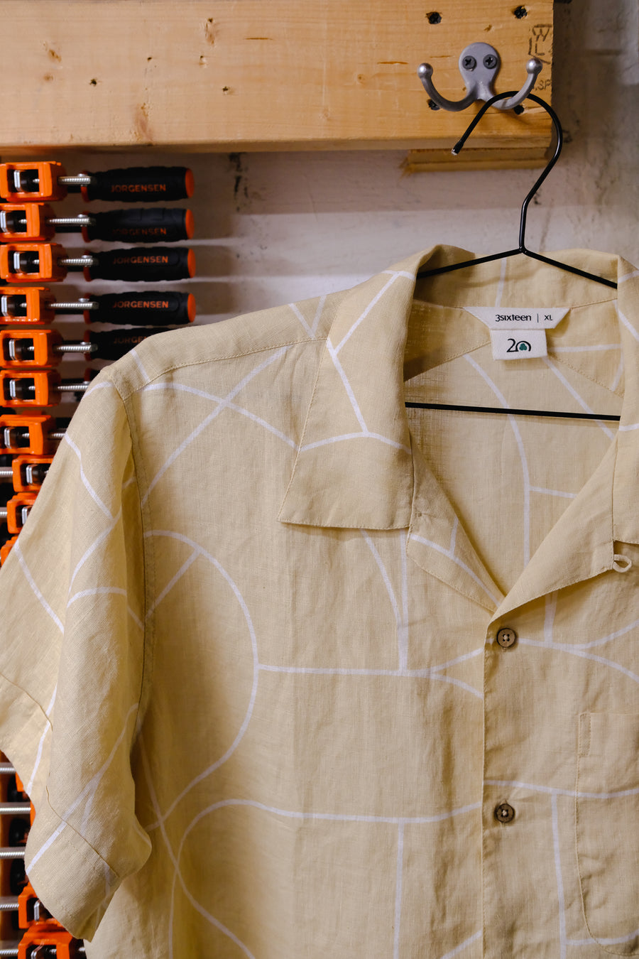
For the project, there’s one piece you worked on and one piece we worked on. There’s a silkscreen print that we made in an edition of 100, and alongside that we took a cross section of the artwork and turned it into a pattern for the fabric of this Vacation Shirt.
Yeah, the screen print shows the full piece, representing the motto, “The Last Shall Be First” and the shirt uses a segment of that as linework which was scaled up and printed onto a beautifully textured hemp fabric.
We’ve gotten to work together a few times over the years and I definitely notice the thought that goes into the way you approach your pieces. Even on this shirt, I love how all the details are considered like the buttons you selected and the way the yoke crosses over on the back.
In the past you’ve created art for us; it was special for us to be able to take your art and turning it into something in our world that people would be excited to wear.
It was really special for me too. I’m really happy with where we ended up, and how this project was a real collaboration on both ends. We started in a much different place and think where we arrived was from being able to lean on one another. We both wanted something that felt balanced from our two perspectives and I think having that trust and respect made the process feel more effortless. I’m really happy with the final result but also to be able to make something to celebrate you all. Happy anniversary!
The Scott Albrecht for 3sixteen Vacation Shirt and Print release Thursday, June 15th at noon EDT on 3sixteen.com. You can also find them in store via our NY & LA flagship stores on the same day.


