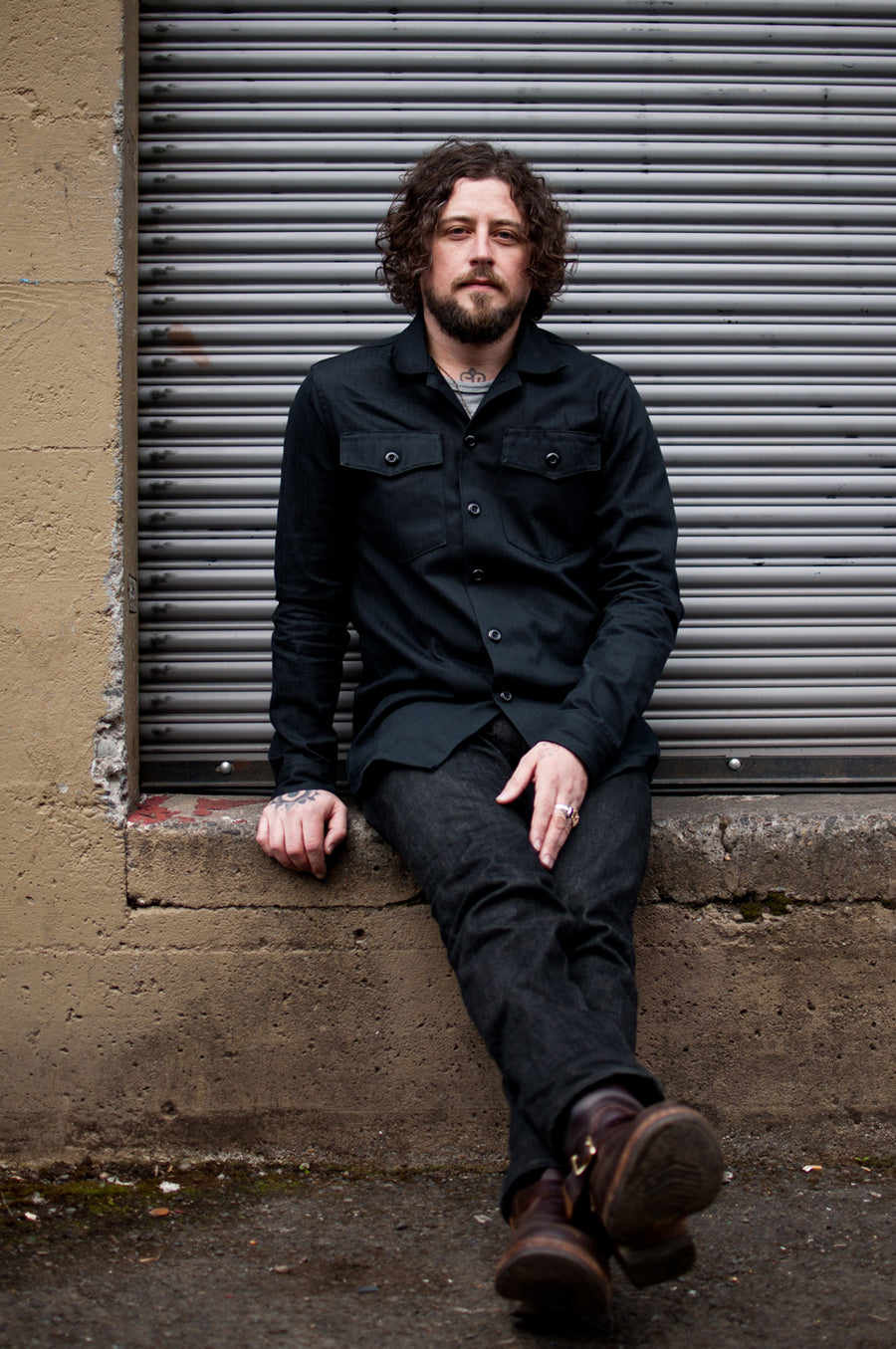
Vanguard: David D'Andrea.

Photos: Christina Elston
Over the years, we've had the good fortune of meeting artists who’ve inspired us with a considered approach to their craft. To introduce you to some of these talented individuals and highlight their work, we’ve decided to launch a new initiative entitled 'Vanguard' where we’ll be commissioning each featured artist to produce a limited-edition collaborative item and sharing a short interview here on our blog.
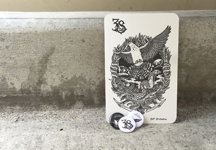
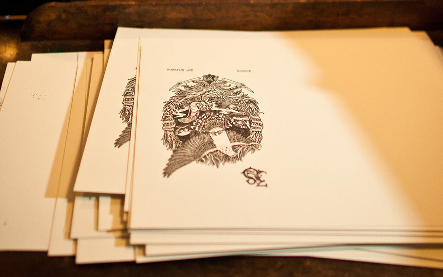
The inaugural artist in this series is Portland, OR-based illustrator David D’Andrea, owner and operator of Samaritan Press. We were first introduced to David's work when a package of beautiful screen prints arrived at our office. We were blown away by the complexity of each piece and immediately contacted David to thank him for the gifts. We have since had the pleasure of meeting several times and brainstorming together with him in person. What began as an idea to visually interpret one of our favorite Bible verses has resulted in an illustration that David created for us and subsequently letterpressed onto a limited number of 4”x6” postcards. While supplies last, we will be including these postcards free of charge in any order that is placed via our website.
“Behold, I am sending you out as sheep in the midst of wolves, so be wise as serpents and innocent as doves.”
While your work is reminiscent of 60’s Psych Rock art, your specific use of muted and earth tones differ heavily from other prominent artists like Victor Moscoso. Can you talk about some of the influences that have helped shape your style, and perhaps even a little bit about the role that color plays in your work?
I think the low key earth tones and muted colors simply describe my personality and surroundings. I live and work on the edge of Forest Park in Portland which is filled with inspiration in the mossy ledges and bright crisp flowing streams. The Willamette River is just outside my door. While I do love and admire the 1960s posters of Moscoso and Griffin, their version of psychedelia was the pulse of San Francisco in 1967 while mine lives in Portland 2015. My inclination is to portray a more organic inward psychedelia rather than a sort of pop art or universal version.
My formative years around skateboarding and punk rock might also have played a role in my use of color. I was heavily influenced by all this work that was either screen printed or somehow reproduced in a low-tech manner. So, until I went to art school, I considered color kind of secondary. For better or worse, it does create a style.
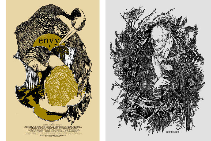
We can’t help but notice the recurring imagery of death, birds, and nature in your art. What draws you to these specific themes? What do you hope to communicate through your work?
I like to convey the idea of earthly impermanence with a skull, transcendence with a bird, or spiritual growth with a plant. These things are implied of course and the goal is to utilize all these great timeless symbols while maintaining a grace and integrity in my art. That said, I also have to assume that a person might simply see these symbols for their surface meaning, and because of that I try to make it all compelling via decoration and pattern. Sometimes a skull is just a skull because it looks cool.
I hope to communicate on a few levels. Since I am an illustrator, there is the task of conveying what I think the client would like. This is obviously the less romantic end of things, but I really do enjoy the challenge.
At the heart of my work I’d like to communicate a sense of the spirit. Not a specific religious thought, but more of a spiritual contemplation. I like to think it goes all the way back to the caves of Lascaux or Chauvet-Pont-d’Arc, which are our earliest signs of communication and spirituality via art. I think the handprints on the cave wall were a means to say we’re here as creative beings on this earth for now. Visual art can be a way to celebrate that, the ephemeral, while contemplating the larger scope of reality. The art itself is just a creative moment that might resonate with people of present and possibly later times. In the end, if my work sparks a little flame of creativity or love in a person that is all I can hope for.
The origin of the name 3sixteen, and honestly it was a complete second read on my part, was an absolutely perfect idea to work with. It dovetailed so nicely with my general interest and the symbols I love to employ. As a fan, I was originally struck by how 3sixteen felt like an artist collective in a way. That, coupled with the incredible quality and style of clothing, was what initiated me to contact you guys. And then upon meeting Johan another layer of admiration and connectivity opened up, which I think has made for a very cool collaboration.
You’ve mentioned before that you see illustration as a trade - could you expand upon this thought for us? How does this idea apply to how you seek to progress as an artist?
I come from a long line of tradesman: plumbers, furniture repairmen, and gunsmiths. As I’ve made my way in the world I’ve realized the relevance and importance of this. I’ve always felt like I have one foot in the gallery and one in the workshop and have learned to use it as a strength. Navigating a career as a freelance artist is so challenging in this day and age. The endless hours drawing and printing are at the heart of my trade but the mail-order, social media, and website upkeep are also necessary on the practical end.
Can you walk us through the process of a commissioned project from conception to final product?
The early stages vary wildly depending on client. Sometimes, when working with certain bands I am close with, there’s a freedom in the initial direction. Whether the ideas are completely mine or a collaborative brainstorming, it always starts with a sketch. Once the sketch is loosely approved and I am certain we are on the same page, I start a preliminary drawing. This is where I work out composition details etc. At this point we are often a few weeks to a few months into the process.
Most of the time my final drawings are done with India Ink on a clay coated panel. Almost everything is rendered by hand on the panel, occasional exceptions being a stray border or font. I collect turn of the century catalogs and other paper ephemera for the sake of useful borders or obscure type details and glyphs. A lot of my posters have these found details in there, not as a focal point, but as a complement to the drawing.
So, obviously the final stages depend on the usage. I highly prefer analog printing methods such as screen printing or letterpress, though sometimes the piece is bound for the digital realm. Screen printing involves a lot of computer time once the blackline is scanned in. Colors are added in layers and I assemble the drawing if was done in pieces.
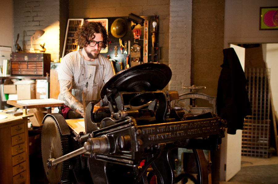
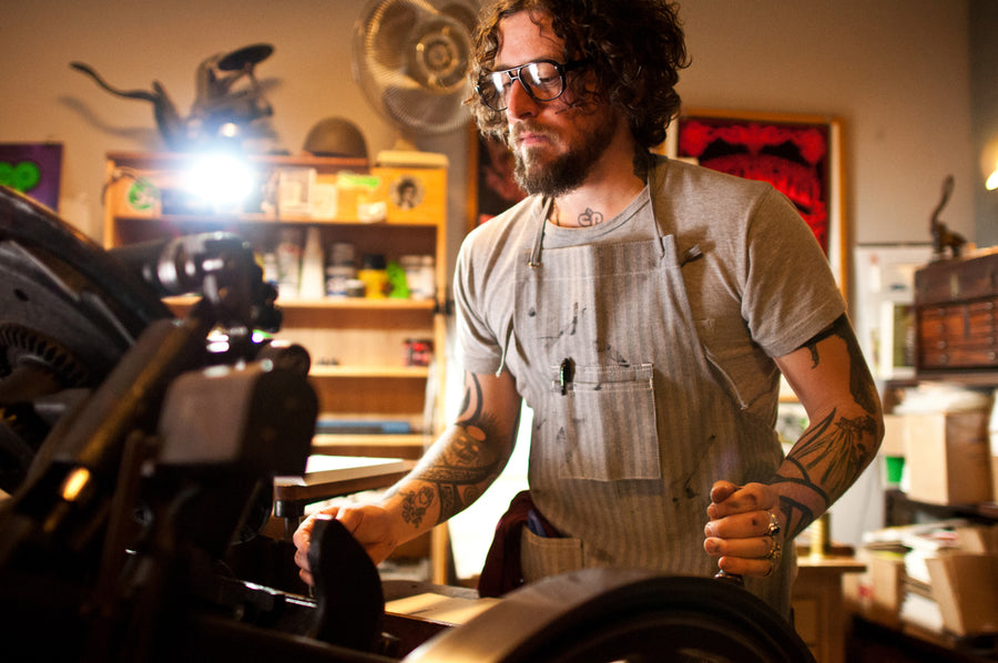
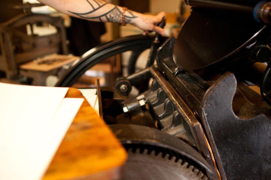
In the case of the 3sixteen cards, I printed them on my letterpress. It’s a Chandler & Price platen press which rolled out of the Cleveland Ohio factory circa 1910. The press is manually powered by pumping a foot pedal called a treadle which spins a giant flywheel. The action is a sort of clamshell movement and the image is printed from a polymer plate. I love that the laborious spinning of the wheel creates a sort of direct energy that is then embedded into each print.
Letterpress is an interest of mine that I love to employ when the project calls for it, but I could devote an entire lifetime to just that skill alone. It’s endlessly exciting for me and I am so glad to have used my press for the 3sixteen cards.
Can you share about any upcoming projects that you’re working on?
I have some Om shows in Brooklyn to concentrate on, a film project with members of Godspeed You! Black Emperor, a sole art tour / trundle across the country from Connecticut to Oregon, and as always working with my community via my Odd Fellows lodge here in Portland. All is good!